Have you noticed how we over embellish? Things can't be awesome anymore, they have to be totally awesome, super awesome, or mega awesome. Something can't be amazing, it has to be flat-out amazing, unbelievably amazing, or incredibly amazing. And I can't be just excited for you, I have to be super-duper excited, awesomely excited, or amazingly excited.
In a world where every kid gets a trophy for participating and is indoctrinated with the idea that they're special because they're breathing, we have to embellish things to drum up excitement.
Don't get me wrong, I think every child is special and unique, I just don't think every one of them has the chance to be an Olympic athlete or movie star because, "If (they) believe it, (they) can achieve it." Since we don't want to crush their spirits, we keep telling them they can do it, they can do it, they can do it. Again, I'm all for not crushing a child's spirit, but I'm also a proponent of reality. One of the reasons my parents paid for every type of lesson I or my siblings expressed any interest in pursuing was because they believed kids needed lots of opportunities to find one place where they could shine.
Not become a mega star, just shine.
We have bought into the notion that something must be extraordinary to be good, and it's killing our kids. The alarming suicide rate in our army is no secret. Many attribute it to the longest war in our history with it's seemingly unending deployments, but within the army another reason is beginning to be floated: young soldiers have no resiliency. They have been cushioned from loss, protected from failure, and coddled when they fall. When they get into the real world where relationships break up or they don't get selected for special forces, they have no coping skills and commit suicide.
To be ordinary or average is no longer acceptable; it's a death-knell.
This Christmas, I wish for a return to ordinary. I wish for people in ordinary jobs to take pride in their work, for those who land in the average category to be content to shine at something, and for children to be content with doing their best instead of needing to be the best.
Until next year,
Becca
Wednesday, December 24, 2014
Thursday, December 18, 2014
Deal of the Decade
 I am always watching for great deals, especially from my favorite stamp company. Let me tell you, folks, this "Deal of the Decade" is the best one yet!! So I went a little wild and ordered a bunch of D-sized sets because, at only $10, I was practically paying half price for them. (My consultant LOVES me!) In addition, I got the Cutie Pie Stamp of the Month at $5, and ordered enough to qualify for hostess credit all on my own allowing me to get a few of those new hostess only sets (see this post for how I used one of them).
It was like my own, personalized Christmas opening that box!!
With all those new images to play with, I went to town. We all know about mixing and matching paper packs, but sometimes we act like our projects are limited to one stamp set, maybe two if one set is mostly graphics and the other is sentiments. Not so, my friends!
Here's an experiment to try. Pull out a bunch of your current stamp sets and lay them on the floor. Reorganize them into piles by style: masculine, hand-drawn, whimsical, bold/graphic, etc. Then focus in on just one pile. Lay the stamp sets out so you can see all the images. I sometimes remove them from their plastic folders and lay them side-by-side so the images all run together like one, big set. I start seeing combinations I wouldn't otherwise.
Another thing I like to do is go blog hopping. I'll see a combination of images that have me reaching for different sets. This card was inspired by one I've had in my file since I first saw it here:
I combined Here We Go (introduced in August) with Sightseer (not shown in catalog but still available to order). To create my circle, I used the Stitch Guide and Piercing Tool. My colors are Flaxen, Sunset, Lagoon, Gypsy, Cranberry, and Whisper.
Using almost an identical layout, (which coincidently happens to be a CAS style of this week's Mojo Monday), I also came up with this card:
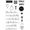
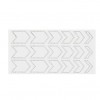
There are three stamp sets used here: Doodled Designs, Cutie Pie, and You're the Bomb. The border is Honey Triangle Washi Tape, but you could easily use the chevron border stamp from the first card to create the same effect. The cherries on top were dotted with Liquid Glass to give them dimension and shine. I used a black marker around the edges of both the cupcakes and the "YOU ARE" banner because I like the way it disguises my fussy cutting and really makes the edges stand out against the background.
The circle from Doodled Designs creates a larger focal point without being too busy. I'll be doing lots with that fun circle! The hand-drawn cupcakes, "irresistible," and arrows tie all the images together the same way the solid, graphic images tie the first card together.
And I haven't even started talking about creating unique sentiments by mixing up words and/or phrases.
If you ever find yourself stuck for an idea, I encourage you to pull a bunch of sets and see what you can combine. Or you can get in on the "Deal of the Decade," order a boat-load of new stamp sets, and let them inspire you!
Until next time,
Becca
Wednesday, December 17, 2014
Writer's World Wednesday - God Doesn't Care
This morning at the gym my friend and I were discussing "God's Plan for Your Life." When she was a young Christian, she mentioned in a Sunday School class that she didn't think God cared if you bought the red car or the blue one. She got jumped on, "God is interested in every aspect of your life," and "Of course you should pray about God's will for your car buying choices." At the time, she felt that everyone else was right and she was wrong.
I'm sorry to say I would have been one of those who was jumping. But over the years, God has drastically changed my mind. Here are some things I don't think God really cares about:
I believe God cares who we ARE when we drive (particularly if we put a bumper sticker on our cars identifying us as a Christian). I believe that God cares who we ARE at whatever college we go to. I believe God cares who we ARE when we go to work. And I believe God cares who we ARE to our spouse.
So, yes, God is interested in every aspect of our lives because who we ARE affects every aspect of our life. But after that, we have tremendous freedom. Do you want to buy the red car? Does it fit your budget and current driving needs? Then buy it! Do you want to go to this college as opposed to that university? Then go! Do you want to be an architect instead of a missionary? Great, then be the best architect you can be! Do you want to marry Joe? Then marry him, and be a wonderful wife.
God cares deeply about all the various aspects of our lives. He gives us guiding principles. In binding relationships (marriage, business), He says it's a bad idea to be unequally yoked. He wants husbands to love their wives and wives to respect their husbands. He wants Christians to be defined by how they serve and love others whether that's in marriage, at work, driving on the road, or in school.
We want to put the burden on God to guide us into the "right" career or "right" college or the "right" car because, once we get His blessing or figure out His "will for our life," then the onus is on God to smooth out our path and make the rest of it easy. It's as though God now owes it to us because, after all, we did the hard work of figuring out "His will." As for marriage, I think God is very concerned with who we marry in the general sense. It defines much of who we will become in the future. What I reject is that God has one person who is our perfect, "designed just for me" mate. When marriage gets hard, we are tempted to say, "Well, this guy obviously wasn't God's will for me, so I'm outta here!"
And here's one that's probably going to get me in even more trouble. I think the "one for me" mentality is responsible for much of "divorce is the unpardonable sin" within the church. But that's a subject for another day.
For now, I leave you with this thought. If you BECOME the person God wants, your choices will take care of themselves.
Until next time,
Becca
I'm sorry to say I would have been one of those who was jumping. But over the years, God has drastically changed my mind. Here are some things I don't think God really cares about:
- What car you buy,
- What college you go to,
- What career you choose,
- Who you marry.
I believe God cares who we ARE when we drive (particularly if we put a bumper sticker on our cars identifying us as a Christian). I believe that God cares who we ARE at whatever college we go to. I believe God cares who we ARE when we go to work. And I believe God cares who we ARE to our spouse.
So, yes, God is interested in every aspect of our lives because who we ARE affects every aspect of our life. But after that, we have tremendous freedom. Do you want to buy the red car? Does it fit your budget and current driving needs? Then buy it! Do you want to go to this college as opposed to that university? Then go! Do you want to be an architect instead of a missionary? Great, then be the best architect you can be! Do you want to marry Joe? Then marry him, and be a wonderful wife.
God cares deeply about all the various aspects of our lives. He gives us guiding principles. In binding relationships (marriage, business), He says it's a bad idea to be unequally yoked. He wants husbands to love their wives and wives to respect their husbands. He wants Christians to be defined by how they serve and love others whether that's in marriage, at work, driving on the road, or in school.
We want to put the burden on God to guide us into the "right" career or "right" college or the "right" car because, once we get His blessing or figure out His "will for our life," then the onus is on God to smooth out our path and make the rest of it easy. It's as though God now owes it to us because, after all, we did the hard work of figuring out "His will." As for marriage, I think God is very concerned with who we marry in the general sense. It defines much of who we will become in the future. What I reject is that God has one person who is our perfect, "designed just for me" mate. When marriage gets hard, we are tempted to say, "Well, this guy obviously wasn't God's will for me, so I'm outta here!"
And here's one that's probably going to get me in even more trouble. I think the "one for me" mentality is responsible for much of "divorce is the unpardonable sin" within the church. But that's a subject for another day.
For now, I leave you with this thought. If you BECOME the person God wants, your choices will take care of themselves.
Until next time,
Becca
Sunday, December 14, 2014
cry. laugh. remember.
Losing a loved one is always hard, but it seems worse when it happens at Christmastime. Using some new stamps, I made two sympathy cards which I hope will bring a little comfort.
The background and butterfly stamps are from the new Seasonal Expressions catalog from CTMH. It's a hostess only set called A Thing Well Done.
 The card base is 4.25 x 4.25, and the inside panel is 2.5 x 2.5. I stamped the architectural elements in Whisper ink, then sponged over top in three coordinating colors. I started top right with the Crystal Blue, added Juniper through the middle, then Pacifica on the bottom left.
I didn't change my sponge dauber or clean it in between. I think that helps with the blend. I really wanted that bottom left corner saturated with the Pacifica to disguise the bareness. Once I had the depth of color there, I moved back up adding more Juniper and Crystal Blue (again without cleaning my sponge dauber) until it was nice and deep.
Knowing I wanted to cut the butterfly out to mount over top, I stamped the head and antennae in black because I didn't want to have the border necessary if I fussy cut them. I placed the antennae on a spot where the body would cover that muddy place where the two background stamps overlapped. By the time I got the saturation of colors, the Whisper ink was almost indistinguishable and I could have put the butterfly anywhere.
Before I finished with the panels, I dropped water over top. Even though the CTMH inks aren't distress inks, they reacted with the water just fine for the effect I wanted.
The butterfly was stamped in black and colored with Copic markers (BG10, BG72, & B26). After I trimmed it out, I went around the edge with BG72 to avoid any white showing through. That extra effort is really important when you put it up against a dark background.
The sentiment is from a stamp set called Big Hug. The full sentient says, "cry. laugh. remember." I stamped the first two words on the front and the last one on the inside.
I love how this turned out so much that I plan to make about five or six more to have on hand. Nothing can replace the loss of a loved one, but I hope these cards let my friends know they aren't grieving alone.
Until next time,
Becca
 The card base is 4.25 x 4.25, and the inside panel is 2.5 x 2.5. I stamped the architectural elements in Whisper ink, then sponged over top in three coordinating colors. I started top right with the Crystal Blue, added Juniper through the middle, then Pacifica on the bottom left.
 I didn't change my sponge dauber or clean it in between. I think that helps with the blend. I really wanted that bottom left corner saturated with the Pacifica to disguise the bareness. Once I had the depth of color there, I moved back up adding more Juniper and Crystal Blue (again without cleaning my sponge dauber) until it was nice and deep.
Knowing I wanted to cut the butterfly out to mount over top, I stamped the head and antennae in black because I didn't want to have the border necessary if I fussy cut them. I placed the antennae on a spot where the body would cover that muddy place where the two background stamps overlapped. By the time I got the saturation of colors, the Whisper ink was almost indistinguishable and I could have put the butterfly anywhere.
Before I finished with the panels, I dropped water over top. Even though the CTMH inks aren't distress inks, they reacted with the water just fine for the effect I wanted.
The butterfly was stamped in black and colored with Copic markers (BG10, BG72, & B26). After I trimmed it out, I went around the edge with BG72 to avoid any white showing through. That extra effort is really important when you put it up against a dark background.
The sentiment is from a stamp set called Big Hug. The full sentient says, "cry. laugh. remember." I stamped the first two words on the front and the last one on the inside.
I love how this turned out so much that I plan to make about five or six more to have on hand. Nothing can replace the loss of a loved one, but I hope these cards let my friends know they aren't grieving alone.
Until next time,
Becca
Friday, December 12, 2014
Christmas Goodbye
It's a little hard to write this post. For the past two years it has been my privilege to be a Design Team member for Color My Heart. Now it's time for me to step down. Over the past couple years, I have built virtual friendships with the wonderful ladies on the team. Their generosity isn't limited to offering up inspiration. They have blessed me in many, many ways. I will miss being part of the team and am deeply grateful for the time I got to spend with them.
This week the colors are Sorbet, Cranberry, Olive, and New England Ivy.
One of the things I love about CMH is that we often get color combos from older paper packs. This one is called Evensong. I paired it with a recently retired stamp set (Remarkable Wreath - one of my all-time favorites) and a current one (Artfully Sent coordinating - sentiment).
Thanks to all of you who have joined me here because of my participation with this fun challenge. I hope you will keep coming to see more projects and to follow my writing journey. I expect news on whether or not I'll be part of a second collection of novellas any day now. (How's that for a teaser!) And be sure to look for The Homestead Brides in WalMart on February 1, 2015.
Until next time,
Becca
Thursday, December 11, 2014
Sweetheart
Have you seen them? Those gorgeous, one-photo pages that are only half of a scrapbook layout? This week for my Stampin' Buds design team duties, I wanted to see if I could make a page that could either be a one page, frame-worthy 12x12 piece or one side of a two-page layout.
Here's the solo:
And here's the two-page layout:
And here's a close up to show you a bit of the detail:
I've never done a "clean and simple" scrapbook layout before. I think I'm pretty happy with this. What do you think???
There really isn't a lot to explain. The only slightly tricky thing I did was to bend the Slate Twisty Ties so they had a little wave to them. I adhered them with Liquid Glass (love that stuff!!). And to get the edges of my script background to fade out, I simply dabbed the edges with a wet rag before stamping.
Now the only question is where to put this: in a frame on my wall, or in a scrapbook.
Until next time,
Becca
Wednesday, December 10, 2014
Writer's World Wednesday - Preparing to Launch
Over the past several years, book tours have gone the way of the dinosaur. Not enough people come and buy books to justify the cost of traveling from place to place to meet readers. Instead, authors have started doing "launch parties" (or maybe they always did them and I just never knew a real, live author before).
This week I'm trying to nail down a location for my first launch party. I'd like to use a historic home built by a woman who won a "Land Lottery." It's the closest thing to a "Land Rush" in my town.
 (Brief history lesson: Land Rushes were about the stupidest thing ever invented. Who thinks it's a good idea to make twenty-thousand people rush for twelve-thousand plots of land, many of which have already been claimed by Boomers or Sooners??
After a few, the government finally figured out that they might want to do things differently next time, so they decided to do a lottery. Basically, you bought a "ticket" for a homestead claim and all of them went into a pot. On the day of the lottery, the tickets were drawn and the winner got to choose their location.)
I haven't heard back yet but that didn't stop me from working on finding someone to make apple strudel. My story begins and ends with strudel, and there's even some in the middle. I can't imagine a launch party without it.
Most of writing is solitary. It's fun to break out the "party planner" once in a while to gather and thank those who have supported and prayed for you through the process of birthing a story.
Until next time,
Becca
This week I'm trying to nail down a location for my first launch party. I'd like to use a historic home built by a woman who won a "Land Lottery." It's the closest thing to a "Land Rush" in my town.
 (Brief history lesson: Land Rushes were about the stupidest thing ever invented. Who thinks it's a good idea to make twenty-thousand people rush for twelve-thousand plots of land, many of which have already been claimed by Boomers or Sooners??
 After a few, the government finally figured out that they might want to do things differently next time, so they decided to do a lottery. Basically, you bought a "ticket" for a homestead claim and all of them went into a pot. On the day of the lottery, the tickets were drawn and the winner got to choose their location.)
I haven't heard back yet but that didn't stop me from working on finding someone to make apple strudel. My story begins and ends with strudel, and there's even some in the middle. I can't imagine a launch party without it.
Most of writing is solitary. It's fun to break out the "party planner" once in a while to gather and thank those who have supported and prayed for you through the process of birthing a story.
Until next time,
Becca
Thursday, December 4, 2014
Amour
Once I have my Christmas cards done, it's time to turn my thoughts to Valentine's Day. For those of you from Stampin' Buds who are new to my world, I am a huge fan of Operation Write Home. Their mission is to send hand made cards to deployed soldiers--it's like Hallmark in a box. When my husband was deployed, I received several cards and it really was a highlight for me.
This month I will be working with the Heartstrings paper pack just released in the new CTMH Seasonal Expressions catalog. Today, I'm pairing it with the Amour Occasions stamp set (which you'll be seeing more of later, I guarantee it!). This stamp set is $17.95, but you can get it for only $10 with the December CTMH "Deal of the Decade" promotion celebrating ten years of acrylic stamps. Be sure to read this post for all the details.
My first card is very basic.
I am a huge fan of top panels which measure 4 x 5.25 because it allows me to staple, tape, sew, poke, etc. and then mount over top of a "clean" (as in not stapled, taped, sewed, or poked) card base. It also works really well with 12 x 12 paper because I can get three cards from one 12 x 1.5 inch strips.
My second card uses the sketch from this week's Mojo Monday.
To make use of my 4 x 1.5 inch strip, I adjusted the background and texture paper a bit. My original plan wasn't to do the double stamping of "Amour", but the Lagoon ink didn't show up strong enough, so I offset the black ink second stamping a bit and I love how it turned out so much that I did it...
...on my third card.
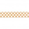
This card makes use of an older Mojo Monday sketch. I love how it turned out, mostly because I was worried about mixing my Gold Polka Dot Washi Tape with the cooler colors of the Heartstings paper. I counted on the design principal of using a color at least twice on any project because it makes the color look intentional. I think it worked and gave this card a very vintage feel.
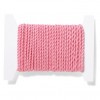
Here's a quick look at how I made the fringe. I simply laid down a layer of adhesive, zig-zagged the twine over top, then snipped and frayed the exposed ends.
I am IN LOVE with this new thick twine, but you will need to use foam mounting tape with it.
As you can see from this detail picture, the two different paper patterns all came from that one 12 x 1.5 inch strip. I could get 8 rows of 1.5 inch strips from a 12 x 12 piece of paper, each cut into 3, for a total of 24 cards. I'm nothing if not cheap...uh, I mean, frugal. Yeah, let's go with frugal.
Before I send these to Operation Write Home, I will dot the glittery puffy stickers with a little Liquid Glass to seal in the glitter. OWH has a few rules to ensure the safety of our deployed soldiers, and one of them is "NO GLITTER!" Those of you who have worked with glitter know how it gets on everything. We don't want any on a soldier's uniform who then goes out for a raid and sparkles through the enemy's night vision goggles.
As we are in the season of giving, I hope you will take time to visit OWH and figure out a way to be involved.
Let's spread some Amour!
Until next time,
Becca
Subscribe to:
Posts (Atom)


