Thursday, May 29, 2014

Jubilee Bonanza

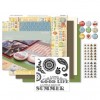
Happy Thursday, everyone.  It's Becca with my fourth and final Jubilee Workshop of the Go post for DrPhilScraps.com.  I decided to do another "what do you do with the stamps after the paper is (mostly) gone" post, so hang on tight because I did a bunch.

Sky cardstock, scraps of Jubilee paper, and selective stamping using a post-it note 
to mask of areas of two different stamps.
 Sunset, Topiary and Creme Brulee
Kraft card, Versamark and Black ink, another example of masking off parts of a stamp 
to create the saying you want, Chevron embossing folder, Topiary and Cranberry markers

On the scrapbook page, I made my glass by cutting the vase from p. 54 of Art Philosophy at 5.5" tall then trimmed off about an inch from the top...or bottom which I then flipped upside down.  I colored it with alcohol markers to add my drink.  I think everything else is pretty self-explanatory, but please leave a comment if you have any questions and I'll be sure to answer them.

Until next time,
Becca

 Product List

Wednesday, May 28, 2014

Writer's World Wednesday-Acknowledgments

The acknowledgments part of a book is usually my favorite even when I don't know any of the people.  Every name represents a much larger contribution to either the story or the life of the author.  Since my novella is part of a collection, I will not have a chance to do an acknowledgment section...so I'm going to do it in bits and pieces here.

I guess I need to start with my dad.  When I was in 7th grade, I did this small creative thing on a writing assignment.  I remember it quite well.  I described a ball connecting with a pane of glass.  My teacher wrote in red pen, "Did it break?"  My father was livid.  An even-keeled man, he was even more understanding of teachers since that was his profession, too.  But looking at that teacher's comment, his ears turned red.  I had expressed myself with creativity and this teacher wanted to put me back in a box.  My dad was having none of it.  He met me after school one day, marched me into that teacher's room, and said he didn't want to see any more markings which stifled creativity.

It was pretty heady stuff for an eleven year old.  And it made me think I might just have a little creativity inside of me.  That feeling has never left because my dad was so adamant about defending it once almost forty years ago.

Thanks, Dad!

Until next time,
Becca

Saturday, May 24, 2014

Life Hath Immortality

I just found out that the mother of my college roomate passed away this morning.  I pulled out the free-hand lessons learned from the Online Watercolor for Card Makers class along with my CTMH inks to make a sympathy card.


The ink colors are Hollyhock, Gypsy, Topiary, and Pear.  The saying is stamped in Black using a retired set called Scrapbooking Sentiments-Poets.

I am linking this up to Heart2Heart: In the Garden and CASology: Flowers  If I can make the free-hand thing work, anyone can!!

Until next time,
Becca

Happy Camper

So excited to be part of the OWH Memorial Day Blog Hop.  I love this organization and appreciate every opportunity I have to participate in bringing smiles to soldiers.  This card falls under the "Love" category.


To give credit where due, I copied Rosemary's card but used my stamps and a red, white, and blue color combination.  I wanted to do something that wasn't strictly patriotic for two reasons: 1) I'm ornery like that and 2) it will be usable for longer than the summer.  Mostly it's because I'm ornery, though.

I will also be touching up this card before putting it in my OWH stash.  Top folding cards photograph better, but side folding cards are better for the OWH tucking process.  It is always my goal to have my cards prepared according to the guidelines so there is no need for them to end up in the card hospital.

See...I can play by the rules sometimes.

Until next time,
Becca

Friday, May 23, 2014

Color Me Funky

This week at Color My Heart, our combination is Sunset, Olive, and Lagoon. It's also the colors for Color Throwdown this week.  I decided to go funky!


I don't know what it is, but several of my last few cards have all had that side panel thing goin' on.  It just WORKS! 

The background is from the CTMH Paper Fundamentals Basics.  One side is a matte printed pattern, and the other side has a glossy resist pattern.  I used sponge daubers to color the glossy resist side of Champagne.  I then went into my stash of paper and literally just pulled out scraps, cut a V in the end, layered them on top of each other, and stapled the whole thing to my card with colored staples.  I stamped the sentiment from CTMH Holiday Tags in Champagne pigment ink.  The colored panel is 5.5x3.75.

So easy, and I think it will work for either a boy or girl, young or old.

Until next time,
Becca

Thursday, May 22, 2014

Birthday Celebration

Happy Thursday, everyone!  I'm here with my third Jubilee Workshop of the Go card for DrPhilScraps.com.  I've been taking the Online Card Class: Watercolor for Card Makers and having a complete blast.  I decided to use the Day 5&6 homework to see if I could make a classy card from stamps that have a "fun in the sun" feel to them.  I think I succeeded.


The trick to this card was cutting the flower stamp into two separate parts.  I have to admit, the first time I cut a stamp apart, it made me extremely nervous. Now I do it all the time because I can always fit them back together.

Here's the general technique:

Stamp the flower in Honey and roll the edges in Cranberry. I stayed with the colors in the Jubilee paper kit, but this would be gorgeous in a pastel version.  Use watercolor paper for the best result.  Stamp one flower at a time and take a wet paint brush to blend the edge between Honey and Cranberry.  (Hint: Create your banner piece first and position it on your cardstock without affixing.  Use a pencil to draw a faint line so you know where to place your flowers.)  After all the flowers are done and dry, stamp the leaves in Topiary and tip them with Lagoon.  Again, do one set of leaves at a time and use a wet paint brush to blend the edge between colors.  Let everything dry before proceeding.

To create the blue shading, get the paper wet without touching the edges of the flowers and leaves.  Pick up some Sky ink either from the lid of your ink pad or by using a re-inker and water.  Touch your brush close to the flowers/leaves and let it bleed out.

When dry, stamp and affix your banner.  Or, if you want your banner to sit up higher, stamp "celebration" in Cocoa ink first then affix the banner.  I actually painted my banner after it was affixed to the card.  Maybe not the smartest way to do it, but the 140# thickness of watercolor paper saved me.  After both sentiments were stamped, I flicked Cocoa, Cranberry, and Honey onto the entire card.  I mounted it onto Cranberry cardstock and then onto a Topiary card base.

If you'd like to see another watercolor card I made with a stamp from Jubilee WOTG, you can see it here.

Please leave a comment if you have any questions.

Until next time,
Becca

 Product List

Wednesday, May 21, 2014

Writer's World Wednesday-Writing vs. Writing for Publication

Along this writing journey, it has been my privilege to get to know a few agents and editors.  It is their job to find talent, polish it, and then present it--to take someone like me from a writer to a publishable writer.  There's a BIG difference.

Think of being published like becoming a chef.  Not the kind of chef who takes the recipes developed by the restaurant chain and simply executes them, but the kind who goes to the market to see what's fresh and then develops a menu around those ingredients.  Writers--at least those who want someone to pay for the privilege of reading their creation--must be fresh.  Sure, every story is a rehash or remix of one that's gone before, but it's in the way it's rehashed or remixed and the way the characters start to live and breathe that makes the difference.  It's in the addition of spices, the use of an ingredient in an unexpected way, and even the presentation on the plate that makes you willing to pay for something as opposed to making it yourself.  To look at it another way, think of a painter.  At the Musee D'Orsay a couple weeks ago, I was overwhelmed by the talent of the Impressionist painters.  Van Gogh is not my personal favorite but seeing his work in person is a far cry from a flat picture in a book.  I was standing in front of a haystack painting (tried to find the exact name but gave up after half an hour of Google searching) and listening to the commentary.  Van Gogh had taken a famous painting of his day and given it his own spin.  I can't remember his exact words, but it was along the lines of, "Isn't that what an artist does, takes something already in existence and puts his own creative spin on it?"

Back to the chef analogy...

I'll admit to making a mean spaghetti sauce, but owning a restaurant requires a few more menu choices.  To become a chef takes years of schooling, mentoring, and "paying your dues" as a sous chef before you can open your own restaurant, and even then there are no guarantees.  The same goes for writing.  You start out as a decent writer and then have to submit yourself to the very humbling process of leaning how to write for publication.  Plots, subplots, character arc, twist, black moment, show vs. tell.  These are just a few of the concepts that must be mastered.  And even then there are no guarantees.

One of the things agents and editors tell you that they hear from aspiring writers is, "God gave me the inspiration for this idea."  The rest is implied, although I've heard more than one agent/editor say, "And then this person looks at me and adds, 'So you need to publish this because, otherwise, it would be a sin against God.'"  Really?  How arrogant and foolish.  All inspiration comes from God.  He is, after all, the creator of every good thing including inspiration.  Every card I make is divinely inspired.  Every recipe I tweak to fit the ingredients I have on hand or personal taste preferences is divinely inspired.   Every flower arrangement, sewing project, scrapbook page, landscaping project, and furniture arrangement is divinely inspired.  Creating beautiful things is one way I fulfill my God-given responsibility of bearing His image on this earth.  That doesn't mean someone is going to pay me for it.

There are so many lessons to be learned along the way to publication, but the most important one is this:  If God has told you to write, then it would be a sin for you not to write.  If He has divinely inspired a story idea, write the story.  But just because He has called you to write doesn't mean He has guaranteed publication.

Van Gogh, a man with divinely inspired creative talent, sold only one painting during his life.  It drove him to suicide.  Had he understood that--just because his genius was a gift from God--it didn't guarantee financial success, it is difficult to imagine how much more this prolific painter would have produced and how much happier he would have been.

Until next time,
Becca


Tuesday, May 20, 2014

Freehand Watercolor

I am dutifully fulfilling my last homework assignment for Online Card Classes: Watercolor for Card Makers for Days 9&10.  This is my least favorite card so far.  But I did it...so I'm posting it.


This is why I stamp!  My balloon is off kilter.  I even trimmed that side of the paper to get rid of the worst of it and it's still off kilter.  **Sigh**

On the plus side, my brainstorming meeting was a complete success.  I'm not sure the publisher will like my ideas as well as I do, but at least I have two submissions I feel good about.

Until next time,
Becca

Watercolor Bonus Day

Quick post because I need to go meet my brainstorming partner at Starbucks in order to polish up some proposals for submission.  I watched the videos for the Bonus Day from Online Card Classes: Watercolor for Card Makers and decided to try the one where you emboss a background and then put it through a watercolor wash for a background.


I used Tim Holtz Distress ink in Wild Honey and added drops of CTMH Cranberry and Hollyhock then spritzed it with water.  This took more water than I anticipated.  You really have to get it soaking wet.  Instead of using a score board as shown in the example video to create a raised background, I ran watercolor paper through an embossing folder.

I loved the messy thread in the background, so I took three different colors that matched my background and smushed them all together.  The "hello" was cut with my Cricut.  I added some sequins and a few white pearls colored with Copic R22 to turn them pink.

Off to Starbucks with my new Gold Card (oh, yeah!).  Hopefully the caffeine will jumpstart my brain from card making creativity to character making creativity.

Until next time,
Becca
Saturday, May 17, 2014

Watercolor Paris Floral

Told you I would be back.  Here's homework from Days 7 and 8 from Online Card Class: Watercolor for Card Makers, Faux Hand Painting.  I used one of my favorite stamps from days gone bye--CTMH Paris Floral.


I stamped my outline in CTMH Bamboo.  I don't have distress inks, but I'm pretty sure this technique would have worked better with them.  However, I'm still quite happy with how this turned out.

It's almost 7pm and I've not fed my hubby all day.  I think I might need to pretend to care that his stomach is as important as my stamping.

Until next time,
Becca
Your Laughter

I'm rewarding myself for having finished the first draft of my novella by spending the day playing with the Online Card Class: Watercolor for Card Makers.  I'm on Days 3 and 4.  I used the technique where you put watercolor onto an acrylic block, spritz it, and then put your stamp into the pool of blended colors. I am also entering this in CASual Fridays: Three Thirds challenge since I used three colors (CTMH Hollyhock, Gypsy, and Honey), and Less is More: Flowers.


I liked this technique because it allowed me to get a double bang for my buck.  The flower and the background were both created using the same pool of blended colors from my block.  Plus, it allowed me to put a dot of Honey ink in the center of the flower.  To create even more Honey color there, I went back over it using the Bokah technique where I used a pencil eraser.

It doesn't show up in the photo, but I spritzed my acrylic block with glimmer mist.  The background and flower have a subtle shimmer that is really beautiful.  The sewing wasn't difficult, but it was time-consuming.  It was my favorite part of the example card, though, and I think it was worth the effort.

I am thrilled to have a technique to use with this particular stamp.  It's an old one from CTMH that hasn't seen much use. 

Off to play even more, so don't be surprised if there is a second post--maybe even a third--that shows up today.

Until next time,
Becca
Friday, May 16, 2014

You & Me: Friends

Since I just got back from my big trip--and because I'm procrastinating on getting some writing done--I decided to sign up for the Online Card Class: Watercoloring.  Yep, it's the last day and I'm starting with Day One, but that's how I roll.


I decided to combine a couple other challenges on this card:
Heart to Heart-A Banner Day
Color My Heart: Buttercup and Hollyhock

The design of the card comes from the first video in class where you are supposed to use a stencil to pool the watercolors.  Didn't have a stencil, tried it with a stamp, didn't work so I sortof cheated by embossing the image with white over the top of my watercolor background.  Not cheated...combined techniques. Yeah...that sounds better.

Here's my supply list:

  • Stamps: CTMH Jubilee Workshop on the Go (swirl), CTMH Designed Decor Frame Kit (sentiments)
  • Ink: CTMH Hollyhock, Buttercup, and Cocoa; Versamark
  • Paper: watercolor paper, CTMH Buttercup
  • Accessories: Stampin' Up White Detail Embossing Powder, sequins, Liquid Glass (to adhere sequins), foam mounting tape, white waxy flax
Well, procrastination over.  Time to get this novella done so I'm not pushing my deadline.

Until next time,
Becca
Thursday, May 15, 2014

Sweet as Pie

Hi Everyone!  It's Becca with my second Jubilee Workshop of the Go post for DrPhilScraps.com


I pulled the woodgrain paper from Timberline and cut it with the smaller overlay from p. 50 of the Artbooking cartridge sized to approximately 4.25 x 2.5".  I then backed it with the Honey colored paper from Jubilee.  The flower and leaves are stamps from the Jubilee WOTG inked in Cranberry, Indian Corn Blue, and Topiary.  I fussy cut them to create my layers and topped the flower with a button which is included in the WOTG.

Frankly, Jubilee wasn't my favorite WOTG in the catalog, but the more I work with it the more I am loving both the paper and the stamps.  Goes to show that it's sometimes good to stretch yourself beyond your first impressions.

Until next time,
Becca
 Product List

Wednesday, May 14, 2014

Writer's World Wednesday

Story ideas--or at least little seeds--happen if you just pay attention.  As my daughter and I were touring Paris last week, we heard the story of how 60% of the city was torn down in the 1800's.  The reasons were many: streets too narrow to allow for a breeze to blow away the stench, people unable to avoid chamber pots being emptied on their heads.  But the real reason was because Parisians tended to riot all the time and the army couldn't get their canons through the narrow streets.

So they tore the whole city down and started over again.

What if you were one of the displaced ones? What would you do? Where would you go?  Might you be so desperate that you answered an advertisement to become a mail-order bride all the way in far-off America?

Hmmm...

Until next time,
Becca
Friday, May 9, 2014

Home is...

Are you loving the RV/Camper trend this year?  So many fun images.  I used Camper Crazy from CTMH for this week's Color My Heart Challenge using Cranberry, Honey, Juniper, and Twilight.


I took waaaaaay longer to get this card done than needed.  But, when you have to do a close up of your card, it's best if you haven't got a bunch of smears.  A bunch!  Then I just fussed and fussed some more.  Good thing it turned out this cute!!

Here's the supply list (CTMH in italics):
  • Stamps: Camper Crazy
  • Ink: Cocoa and Juniper
  • Cardstock: Cranberry and Honey (paper pieced bottom of camper and windows)
  • Marking pens: Honey, Twilight, Cocoa, and Copic W3 (gray)
  • Accessories: Sanding Kit, Liquid Glass, Sponge Daubers, white gel pen, heart punch, large deckle edge scissors
I think everything is pretty self-explanatory, but here are some things you might not be able to see:  1) the Honey marking pen was used under the Honey cardstock windows because it's really difficult to cut those teensy, tiny pieces; 2) the Liquid Glass is over the Twilight colored banners (didn't even TRY to cut those out of cardstock); and 3) the camper is stamped on the card base and a second, decorated one was mounted over top using foam tape.

The little flag coming off the back was one of those trying-to-cover-a-flub things that worked out to be perfect.  If you look closely, you'll see a place where I got Cocoa ink on the edge of my acrylic block.  When I stamped "HOME is," a bit of it got right under where that red flag is now.  I was going to cover it with the flag, but it looked better higher.  I hand-drew the flag pole with my Cocoa marker.  I got the red flag from the camper image I had stamped in Cocoa on Cranberry cardstock.  It's the awning that's on the right side of the camper with little ruffles hanging off.  I cut off the ruffles and flipped the awning upside down.

The sentiment comes as one block of text.  I cut it in half to separate the saying.  If I were to do this over again, I would stamp "HOME" by itself on the top, and add "is" to the bottom strip of words.  But, after as much time as it took to get this done, I wasn't about to start over again.

As this post goes up, I am on a plane heading back from my mother-daughter trip to Paris.  And, no, we didn't stay in an RV!

Until next time,
Becca

Thursday, May 8, 2014

One in a Melon

Happy Thursday, everyone!  It's Becca with my first Jubilee post for DrPhilScraps.com.

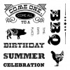
Summer is on its way, and with it comes lots of opportunities for celebration.  I used the Jubilee WOTG and coordinating Fancy Fair stamp set to create a birthday card for my dad.


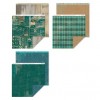
The B&T paper is two sides of the same piece. I cut a 5.5"x 6" piece and used scissors to cut and notch out the ticket shape. I glued the two pieces to a 5.75"x 5.75" piece of Cranberry cardstock, overlapping where the blue pattern and ticket pattern met enough to cover where the ticket notches were cut.  I cut a 6"x 12" piece of white cardstock and folded it in half for my card base.

Because the paper had so much pattern to it, I needed the large accent circle to be one color. I embossed the circle image with clear powder then used a Sponge Dauber with Cranberry ink to create more definition.

The watermelon was stamped in Topiary and Cranberry.  Using the same Sponge Dauber with Cranberry ink, I colored the watermelon, cut out the pink part, and mounted it over top of the Topiary image.  I used a black marker to color the seeds and topped them with a touch of Liquid Glass to make them shine.

The sentiment is from one of the zip strips. I trimmed it down and cut a banner notch in the end.  I should have glued it down before I did the stitching, but I forgot.  You can't see it in the photo, but I left the "Melon" part of the sentiment loose and curled up the edge for a little dimension.

To give myself a triangle of black, I added sequins to the top left.

Here's the inside sentiment. Using the Fancy Fair set, I stamped "Come One, Come All To A" in Pacifica on the inside of the card. I then stamped again in Cranberry on a small piece of white paper.  I cut the "Come All" out and glued it over top of the Pacifica one.  The rest of the images are single stamps with additional ink colors of Topiary and Honey.  I didn't bother to make ruler marks, I just eyeballed it.  Love that about the clear stamps!!

Since I was including this card in a large, padded envelope with a set of notecards for my mother's birthday, I didn't have to worry about the extra postage due to the odd size and extra thickness.  If you were to send something like this in regular mail, I highly recommend using either a padded envelope or cutting some bubble wrap to include in a regular envelope.

For those of you paying attention, yes, that means my mother's birthday present went out in the same envelope as my father's birthday card. And yes, that makes me something of a terrible daughter.  However, when this post goes live, I will be in Paris and looking for gifts which will elevate me back into their good graces. LOL!

Until next time,
Becca


 Product List