Before you feel sorry for me, let me tell you that my desk is overflowing right now.
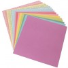
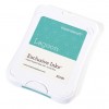
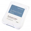
I used the sketch from this week's Less is More challenge as my jumping off point. The background panel is Flaxen from the Whimsy Fundamentals paper pack. One side is regular patterned paper, but the other side is the same pattern but with a plastic coating instead of two colors. I stamped the architectural image over top of the resist side using Indian Corn Blue ink then wiped off the excess ink with a clean, dry cloth. I stamped the image three times, the bottom one upside down for the fun of it. I mounted the panel on Lagoon cardstock and sewed around the edges. (Why not an Indian Corn Blue background, you ask. Well...because Lagoon was sitting out and Indian Corn Blue wasn't. Besides, the Indian Corn Blue looks almost Lagoon over top of Flaxen paper.)
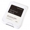
The butterfly was stamped in Black Archival ink on scratch white paper, then again over top of the background panel to get the antennae. You must, must, must let that dry for a long time before you touch it so the ink doesn't smear.
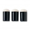
I used sponge daubers to ink the butterfly edges in Lagoon (top wings) and Indian Corn Blue (bottom wings). I did the edges first then started from the center and worked out leaving white space between the colored portions. I cut it out and glued only the center to the background panel. The picture doesn't show it well, but the wings are bent up to give added dimension.
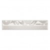
White shimmer trim was stamped with the sentiment in Black Archival. Again, let it dry for a long time. (Note: the link below is for Silver Shimmer Trim because the White wasn't showing up.)
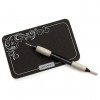
Finally, I used the stitch guide and piercing tool to create the butterfly tail.
Here are a few more pictures of cards I've made using this set. The links for instructions are below each:
I love the saying on the last card. It comes with the set, and I think it's very true. However, the reward of being a hostess is getting this set for only $8.00!! There's no link below because it's a hostess set, so here's a picture of the set:
Get it while you can because you're going to regret not having it along about April!
Until next time,
Becca



I love that set, too. I think it's because of the butterfly :)
ReplyDeleteFantastic cards Becca and that butterfly stamp set is amazing.
ReplyDeleteThe first card looks like a 'real-life' butterfly. So effective and a super take on the sketch.
Thanks so much for sharing and taking part.
Sarah xx
Less is More
What a beautiful bunch of cards Becca, I love those backgrounds!
ReplyDeleteThanks so much
Chrissie
"Less is More"
Gorgeous cards! The texture on the banner of the first card is fabulous!
ReplyDeleteAwesome colouring on those butterflies, what a fab bunch Becca!
ReplyDeleteThanks so much for joining us this week.
Anne
Less is More