Tip #1: Let you white space shine.
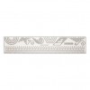
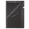
There are a several things that go into a good white space. First, your work is clean, no smudges...at least no unintentional ones. Second, use good quality cardstock. It needs to fold well, cut without leaving jagged edges, and take ink well. White Daisy cardstock, baby. As much as you can get your hands on! And finally, the importance of the Score Board can't be overstated. Folds are crisper with no breakage, plus you can create top folding cards which not only photograph better, they are different from what you get in a store which makes your card stand out from the crowd.
Tip #2: Add detail without adding bulk.
I also angled the tag as opposed to leaving it straight. The juxtaposition of a straight line against an angle adds another touch of interest.
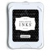
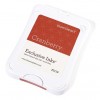
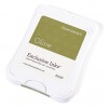
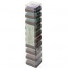
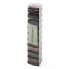
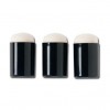
I was able to do the two colors around the edge and in the middle by using pigment inks. Their cube shape is small enough to do this technique without having to mask off parts of the stamp. I took the extra time to sponge around the edges of the tag with Olive ink (dye based) for two reasons: 1) it deepened the color around the edge creating a more definitive edge, and 2) any time you add shading it gives your project extra depth. (I used Cranberry and Olive because they happened to be on my work table. They are in two different ink stacks so I included the link for both below, but you could easily get by with just one ink stack.)
Use foam tape to create depth. You aren't adding anything of "weight" to your card in terms of design, but you give what's there more impact.
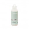
To get the embroidery floss to stay in place, I placed a dab of Liquid Glass on my index fingertip and smooshed it flat against my thumb. I pinched the floss at the points I wanted to adhere to the tag, and pressed them down lightly making sure to leave a little curve.
Tip #3: Use design principles to full advantage.
Because there isn't much to a CAS card, what's there must make a big impact.
Here I used several principles when putting together my cluster.
First, I created a cluster. Within that cluster, I placed the two gold sequins and the Dec 25 circle in a triangle. I used variety in the sizes of the sequins, neither of which is the size of the Dec 25 circle. (My original plan didn't call for the sequins, but I ended up with a smudge. Small sequins to the rescue...so then I had to add the larger sequins. Then I had to add the Dec 25 to complete the triangle. So, you see, covering that smudge led to better things.)
Second, I used contrasting colors. Red and green are opposites on the color wheel. One brings out the best in the other.
Third, I used the principle of thirds. (See how I did that...made the "thirds" principle third on my list. I'm so clever...and humble, too. LOL!) If you were to pick the center point of the cluster and draw a line horizontally and another one vertically, those two lines would be one third of the way up from the bottom and one third of the way from the right edge of the card base.
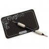
I then went back to Tip #2 and used the Piercing Tool and Stitch Guide to create a type of border that adds interest without adding bulk, I sponged Olive ink around the Cranberry tag, and I foam mounted the red tag and the Dec 25 dot to add depth to my layers.
Tip #4: Create a CAS background using good design principles, then throw something bold over the top.
I'm going to be honest, this card took forever to come together. I had the idea in my head but couldn't get it to come out on paper. I was losing sleep over it. Really, I was!
Anyway...look at the background and the ticket for a moment. They follow good design principles.
The greenery in the background is at an angle and covers about a third of the center panel. Instead of dotting the berries with red, I used brown to create a contrast without drawing the eye too much.
The ticket is placed about a third of the way up the card and a little less than a third away from the right edge. If you were to take the tag out, the background and ticket would be a well designed card. But then you throw that bold tag on it, move the ticket over a smidge because the eye is drawn to the point where ticket and tag intersect, and voila!
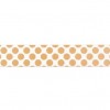
The tag was cut out of Yuletide paper in the exact shape of the first card because I took the clear stamp, laid it on the paper so the design would border the left side, and then cut around the stamp with my Micro-tip Scissors being very careful to not nick my stamp. To create the "string," I folded the Washi Tape over on itself lining up the gold dots and trimming off any excess. I then folded it in half again and looped it through the top of the tag. I used the excess trimmings of Washi to wrap around the ties.
To finish, I sponged around the ticket, tag, and bottom/right corner of the inner panel with Olive ink. Also, note that the sequins (two different sizes) and the Washi tape "strings" are placed in a triangular shape with the similarly colored ticket. The stitching around the edges is another example of adding interest without adding bulk, as is a white on white border.
In the interest of full-disclosure, that center panel was giving me fits. I tried it on a green background, a Kraft background, a sponged background, a sponged background with stamping over it, with sponged edges to match the sponged background, with another mat between the white on white of various colors. Aaaaaack!! But I kept fussing and trimming and trying until it worked. I knew my design principles were good, I just couldn't get the background right.
All of these cards can be recreated once the Yuletide paper is gone. The bold tag can be cut from plain cardstock and run through an embossing folder, stamped, or cut from a different patterned paper. But those tickets...Oh! I love those tickets.
On Thanksgiving Day, I'll show you how to stretch this very Christmassy set into all sorts of occasions using those wonderful little tickets!! You can leave the men to their turkey coma football frenzy and come play.
Until next time,
Becca



No comments:
Post a Comment
Thanks so much for taking the time to comment. You bless me!